Overview
VISIT is a Healthcare Customer Relationship Management (CRM) software for House Call Doctors. This Java desktop application is based on a Command-Line Interface (CLI) application called AddressBook3. Our team is called UnrealUnity, consisting of 5 members including myself, and we decided to create VISIT to provide freelance doctors an affordable and easily accessible tool to use without breaking the bank. VISIT allows these doctors to manage their patient’s information, allowing them to store personal details and write reports after a medical checkup with a patient. VISIT is also able to store appointments for tracking purposes and store shortcuts for quicker inputs.
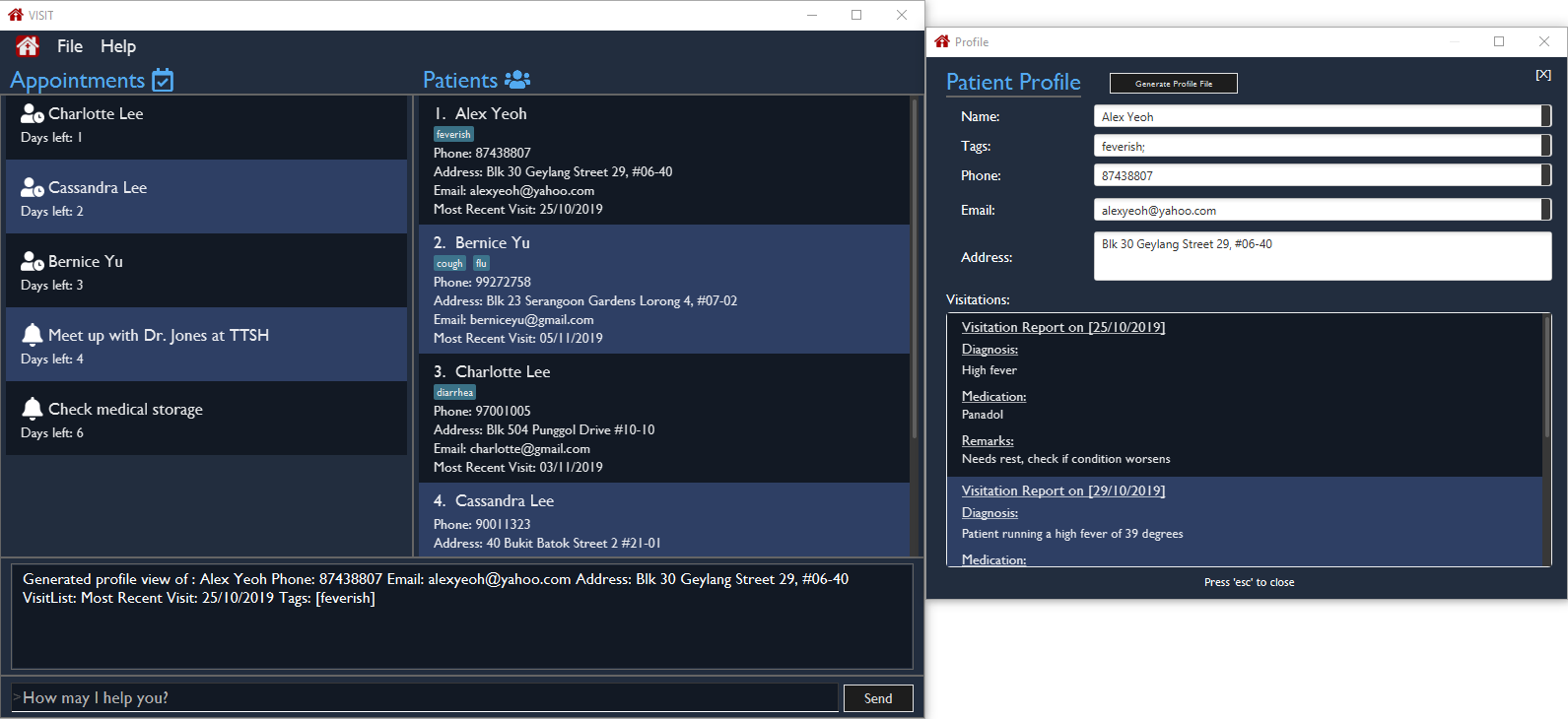
My role was to conceptualise a new UI redesign that could utilise the above features and implementing it. This document details my contribution to the project and the design considerations I have made.
Summary of contributions
-
Major Enhancement: Created a UI redesign
-
What it does: Allows the user to view their information in a simple format with clear visibility.
-
Justification: Doctors spend a large amount of time organising patient information so VISIT is designed to allow them to work with great efficiency.
-
Highlights: The UI uses a dark colour palette and a neat font that is suitable for long sessions. The UI also displays the two most important features, the patient address book and the appointments, in a single Window so that it is quickly visible for the user.
-
-
Code contributed: [RepoSense]
-
Other contributions:
-
Project assistance:
-
Assisted team member in creating the UI backend of the Appointments System, enabling it to be displayed properly on the Main Window. (#113)
-
-
Project management:
-
Created the Team Organisation and prepared the Project Repository for the team.
-
Helped review team members' Pull Requests
-
-
Documentation:
-
Updated documentation for the project, example: #199
-
-
Community:
-
Reported bugs and suggestions for other projects (examples: 10 issues opened in treasurerPro)
-
-
Tools:
-
Integrated Coveralls (a Github plugin) to the team repository
-
-
Contributions to the User Guide
Given below are sections I contributed to the User Guide. Since the UI portion does not have any new commands, I have included details on the future concept of the UI in v2.0 and above. |
Improved UI [Coming in v2.0]
With more features being added in v2.0, the UI will be reworked to allow new and old features to have great accessibility and usability. The new UI will utilise a dashboard system so that Doctors are able to view more information as we scale up VISIT’s functionality. Each tab in the dashboard will represent a feature, i.e. The Appointment list will be a tab containing a Calendar view that tracks reminders and followups by the date and time, with a pop up notification on launch and near deadlines.
Contributions to the Developer Guide
Given below are sections I contributed to the Developer Guide. They showcase my ability to write technical documentation and the technical depth of my contributions to the project. |
UI component
API : Ui.java
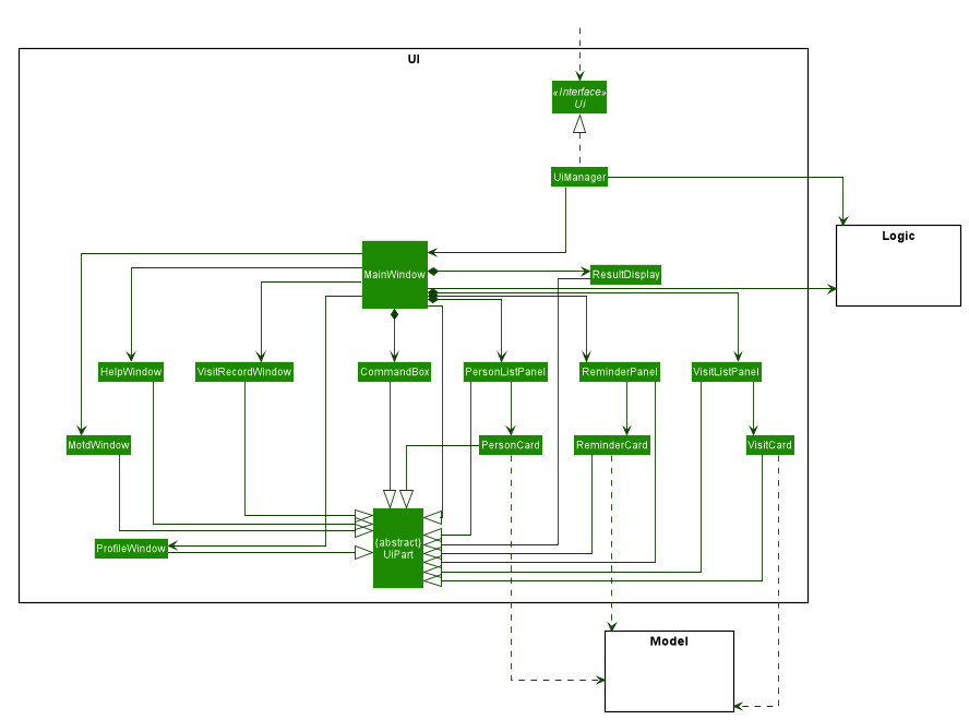
The UI consists of a MainWindow that is made up of parts e.g.CommandBox, ResultDisplay, PersonListPanel, ReminderPanel, etc.
All these, including the MainWindow, inherit from the abstract UiPart class.
Other UI parts such as HelpWindow, VisitRecordWindow, are not displayed as UI elements in the MainWindow but opens up through a command entered.
The UI component uses JavaFx UI framework. The layout of these UI parts are defined in matching .fxml files that are in the src/main/resources/view folder. For example, the layout of the MainWindow is specified in MainWindow.fxml
The UI component,
-
Executes user commands using the
Logiccomponent. -
Listens for changes to
Modeldata so that the UI can be updated with the modified data.
Model component
API : Model.java
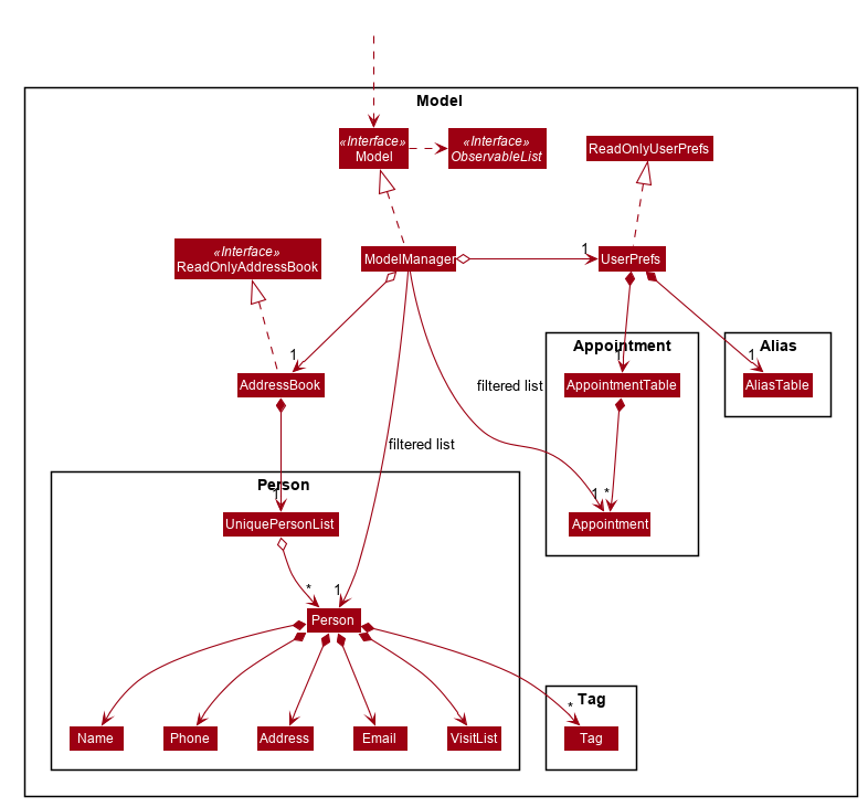
The Model,
-
stores a
UserPrefobject that represents the user’s preferences, alias and appointments. -
stores the Address Book data.
-
exposes an unmodifiable
ObservableList<Person>andObservableList<Appointment>that can be 'observed' e.g. the UI can be bound to this list so that the UI automatically updates when the data in the list changes. -
does not depend on any of the other three components.
Storage component
API : Storage.java
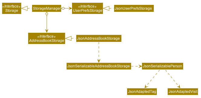
The Storage component,
-
can save
UserPrefobjects in json format and read it back. -
can save the Address Book data in json format and read it back.
GUI Redesign
The GUI Redesign is done to include the new features made for the VISIT application, as well as improve the overall user experience with a easily readable interface that displays every important information in a glance.
Current Implementation
The current redesign of the GUI includes the addition of:
-
the
ReminderPanelto display upcoming appointments -
the
VisitListPanelto display the visit reports stored in a patient’s profile. (as mentioned in Visitation Report feature) -
the
VisitRecordWindowform for the user to enter the required information. (as mentioned in Visitation Report feature) -
the
ProfileWindowto display the full profile information of a patient. -
the
MotdWindowto display the appointments in a new window. Motd stands for Message of the Day.
In addition to these, VISIT’s CSS theme is updated to fit current standards of GUI design, with a more pronounced color palette and a clearer font.
The following is the snippet of the class diagram of the Ui Component with the new Classes:
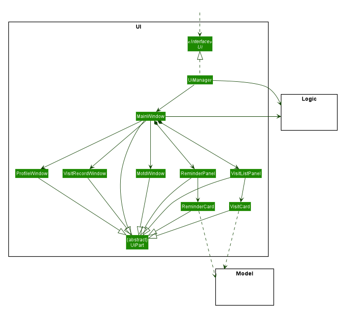
-
The
MainWindowhas been new panel which is the ReminderPanel. -
Three new Windows,
VisitRecordWindow,ProfileWindowandMotdWindow, are in use in addition to the MainWindow. These windows are opened through their respective commands. -
ReminderCardandVisitCardgets its data from Model, similar to PersonCard.
Future implementation [Coming in v2.0]
For future GUI design considerations in v2.0 and above, the panels of each feature such as PersonListPanel and ReminderPanel can be
separated by tabs, through a dashboard interface. This allows more information to be displayed within each tab, allowing
users to work with more data.
Design Considerations
When choosing the new design for the UI of VISIT, I had to consider what was the best design that could showcase all the features made by the team. In addition to that, I needed to choose a colour scheme and layout that would be appropriate for today’s design standards.
Concepts
The first concept tries to fit all the raw features into the Main Window. A simple wireframe design that allowed me to see the possibilities of different layouts. However, this is too barebones and I started expanding on this.
The second concept I came up with tried to include the Visit Report feature into the Main Window. The Patient Address Book
was then broken down into two parts, the short list of patient names in the top right panel and the full profile of a
selected patient in the center window. The idea came from some examples of Address Book applications I found online.
However, the panel layout for the design was too messy and was too small for the Visit Report feature.
For the third concept, I decided to shift the Visit Report to a separate window as per the Profile feature description. This gave a more focused view on the Visit Report feature for the user. A banner was also added to label the application in UI. A light orange colour scheme was used because I thought it would be a colour that was easy on the eyes of the user.
After discussing with the team, the orange colour scheme did not bode well and made the application too spunky. I decided to look up popular sites, such as Facebook and Twitter, to get inspiration on professional web design. From there, I determined that a dark blue colour palette would fit appropriately with current design standards, giving a less boring look to Dark Theme. The colour palette also fit the criteria of being easy to look at.
Following the inspiration mentioned in the previous concept, I opted for a two panel layout for simplicity. The information has an equal amount of shared space, allowing the user to quickly identify the data they are looking for. Also, the banner was changed to a much neater icon of the VISIT application because I found the previous banner to be too intrusive and overbearing. This concept was well-liked among the team, therefore I chose this concept to be the target design for the UI.